The Polis Project
Brand Strategy & Visual Identity
Overview
The Polis Project built a loyal following covering resistance movements and social justice through activist journalism. As they expanded into mainstream reporting, their existing brand identity—rooted in grassroots aesthetics—risked limiting broader audience reach.
I redesigned their visual identity and digital presence to bridge cult appeal with mainstream credibility, enabling the organization to grow without sacrificing its editorial voice.
Context
Client Background
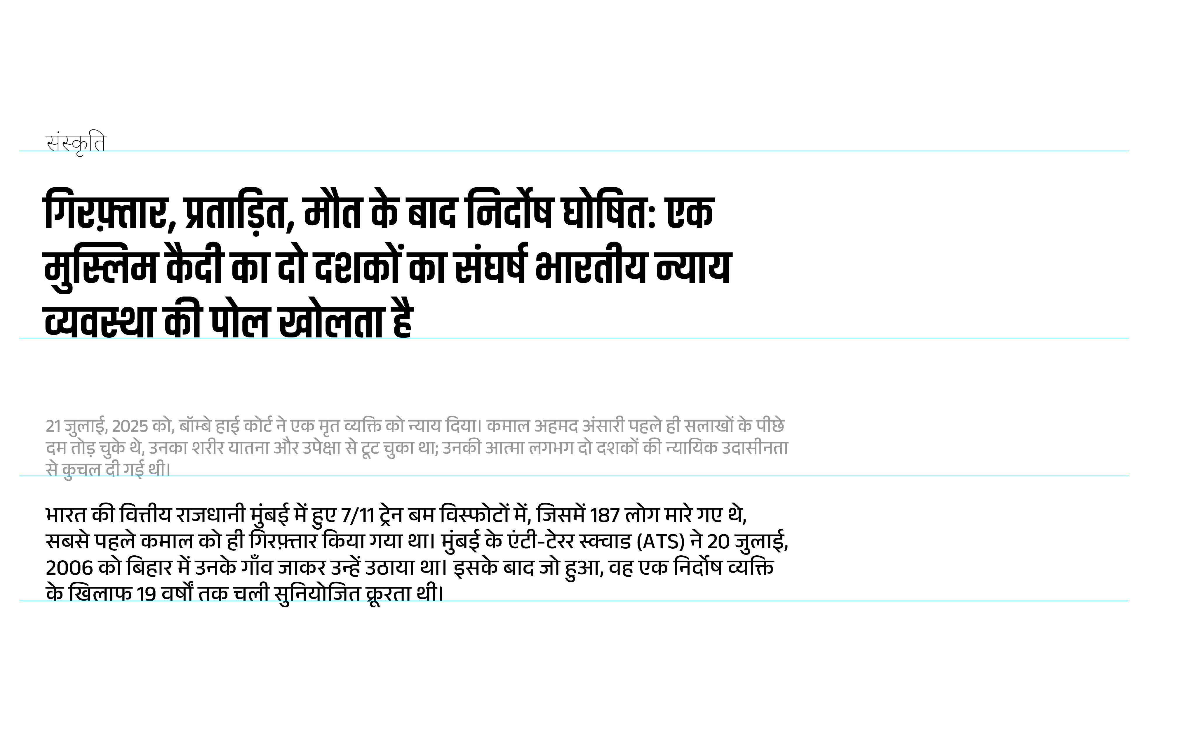
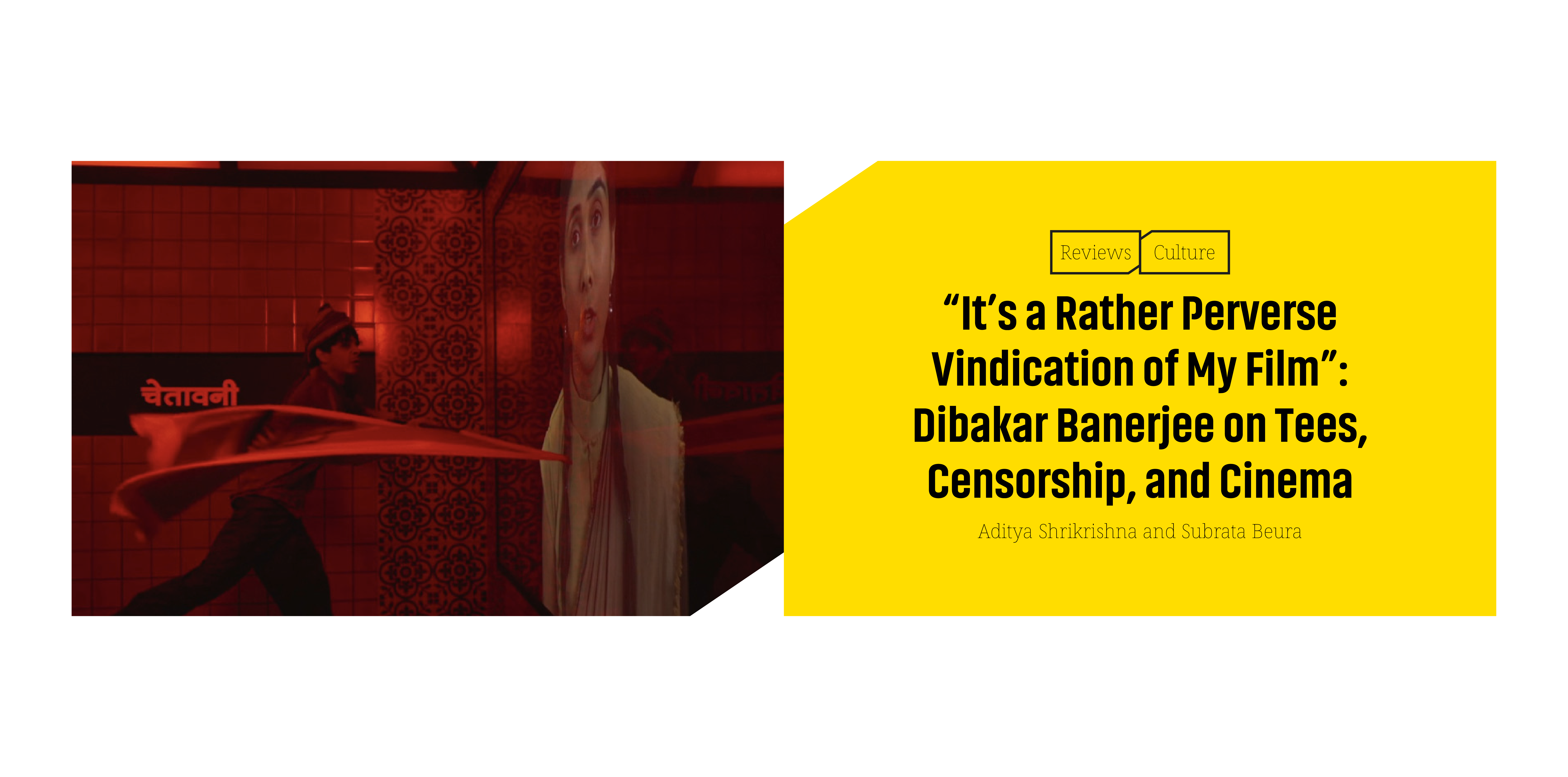
Over the past five years, The Polis Project has built a devoted following covering resistance movements, authoritarianism, and social justice. Their fearless reporting earned 28,000+ loyal readers who valued their uncompromising voice.
"We want our design to be sophisticated. Sophisticated design amplifies voice; it doesn't dilute it. The idea is to make Polis look like what it means: real reporting, real stories, and authentic voices."
Core Challenge
How do you evolve a grassroots brand to reach mainstream audiences without alienating the core community that made it successful?
The Problem
Strategic Barrier to Growth
The Core Issue
Polis Project's raw, activist-blog aesthetic and inconsistent brand presence undermined perceived editorial credibility and professionalism in the eyes of mainstream audiences and potential institutional partners.
This created a strategic barrier: the inability to scale reach, grow subscriptions, attract broader demographics, and secure partnerships—all while preserving the uncompromising voice and authenticity that defined its mission.
The Strategy
1. Heuristic Analysis & UX Audit
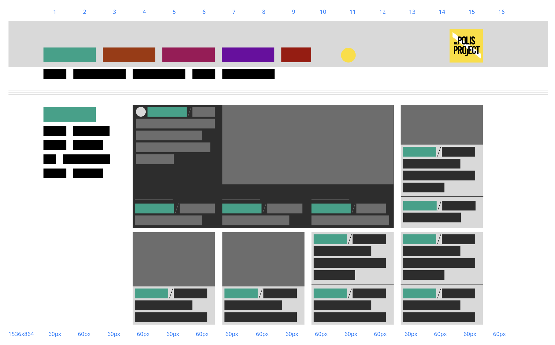
By conducting a heuristic audit and redesigning the information architecture to support the Topic Cluster model, I optimized the digital experience to signal journalistic authority—making content more discoverable, navigable, and trustworthy—while preserving the authentic, uncompromising voice.
Strategic Rationale & Execution
Problem: The existing site's raw, cluttered interface and inconsistent navigation created usability barriers that eroded mainstream credibility—leading to high drop-off rates and poor multilingual accessibility.
Solution: Conducted a comprehensive heuristic audit to identify and resolve 12 key friction points, including visibility issues, error-prone flows, and navigation confusion. Then, redesigned the information architecture with a streamlined sitemap integrating pillar pages.
Metrics & Outcomes (Post-Launch, October 2025 – January 2026)
Subscription Impact
Contributed to 6.7% subscription growth in the first three months (exceeding the 5% target), as deeper content journeys built trust and converted mainstream readers into subscribers.
Impression Rate Increase
Grew the viewership impressions created on certain articles prior to launch from ~3k to 4k to up to an average of 12k.
2. SEO Topic Cluster Model
To directly support the brand repositioning goal—scaling mainstream reach and credibility without diluting authenticity—I implemented a Topic Cluster Model as a core digital strategy lever. This shifted the site from a linear, chronological feed (which drove high bounce rates and limited discoverability) to an interconnected content architecture built around Pillar Pages and supporting Cluster Articles.
Strategic Rationale & Execution
Problem: The previous linear, chronological feed resulted in users reading one article and leaving (high bounce rate), poor internal linking, and limited visibility in competitive search results for mainstream audiences.
Solution: Shifted from a linear feed to an interconnected content architecture built around Pillar Pages and supporting Cluster Articles—implementing a Topic Cluster Model to improve discoverability and engagement.
Metrics & Outcomes (Post-Launch, October 2025 – January 2026)
Bounce Rate Reduction
Decreased from 60% (pre-launch baseline on niche pages) to 40% (a 33% relative improvement), encouraging users to explore multiple articles per session.
Average Session Duration Increase
Uplifted by 50% (from ~1:45 minutes to ~2:38 minutes), reflecting deeper engagement and horizontal browsing across pillar-cluster content.
Highlighted Outcomes
in first 3 months
from 192k to 382k
from 25.2k to 33.9k
from ~7.8k to ~12.2k
* All metrics as of January 2026
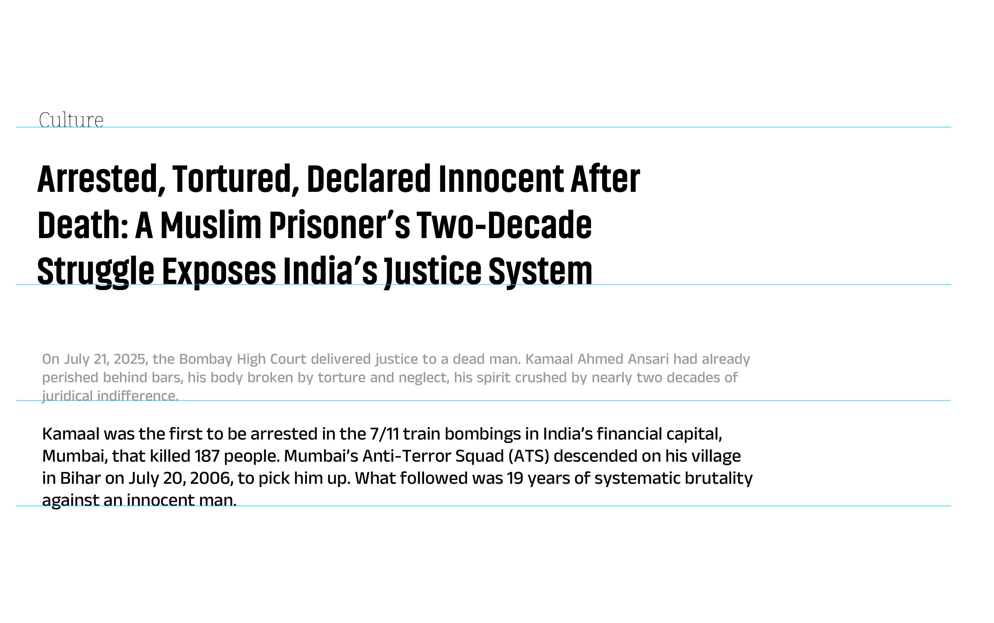
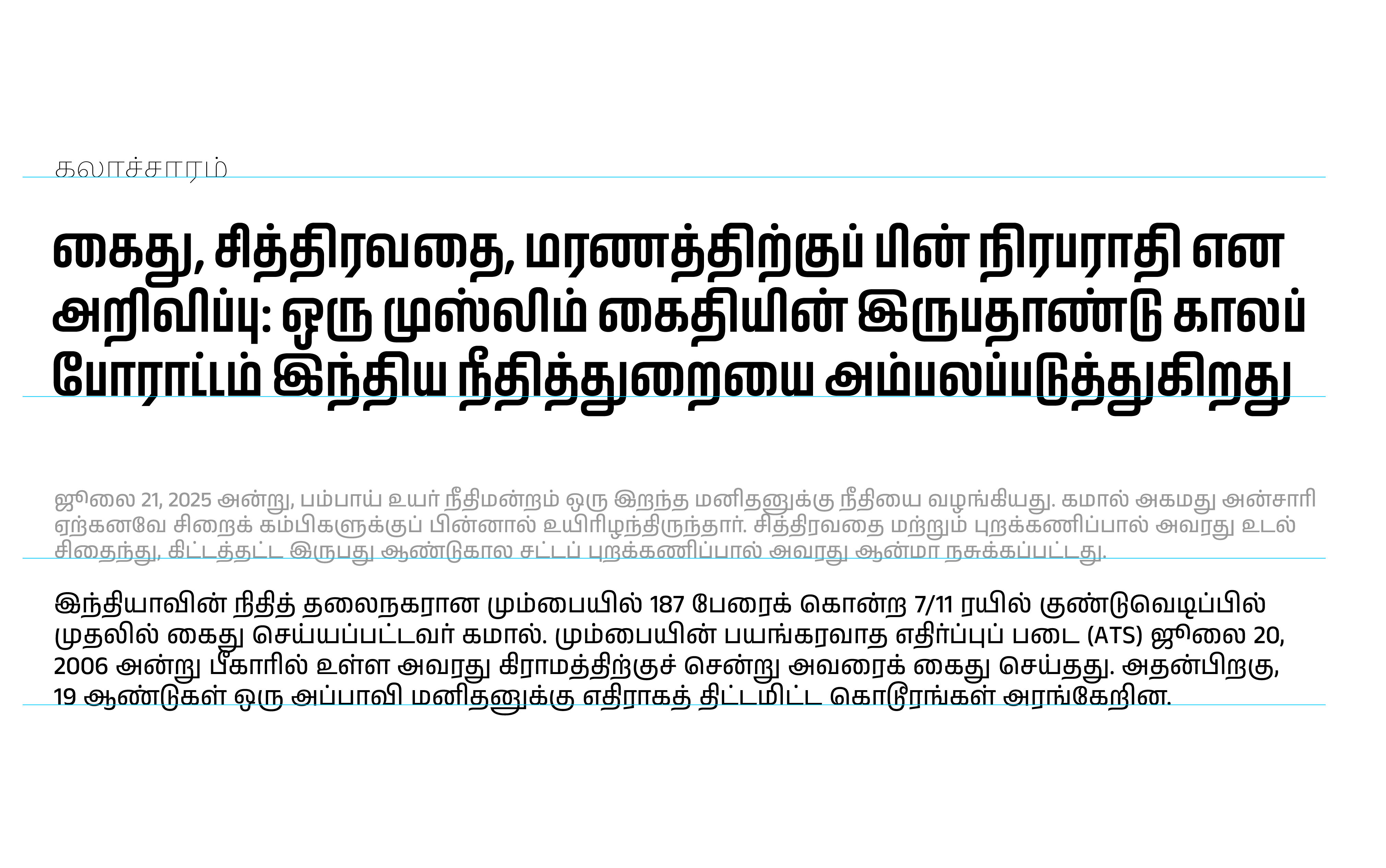
Design Solution
Breaking from both activist blog aesthetics and sterile news design, I developed a refined yet distinctive identity that honors Polis's roots in grassroots movements while creating space for serious investigative work.
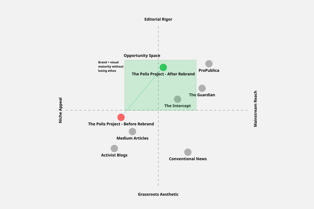
Competitive positioning (before and after rebrand)
The Identity
I evolved the existing mark to emphasize structure and order through type—signaling editorial authority—while maintaining bold forms that reflect Polis's uncompromising stance. Layered elements represent the depth of investigative work.
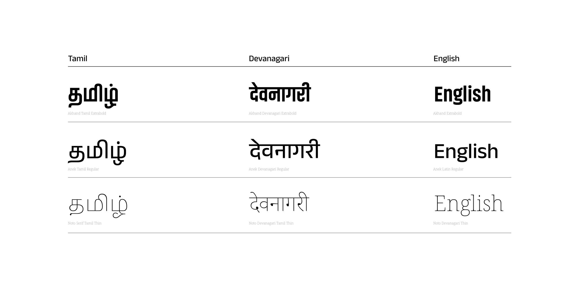
Typography: Editorial Confidence
The type system balances authority with edge.
The Strategy
- Editorial Serif Brings journalistic gravitas to headlines—connecting Polis to a tradition of serious reporting.
- Modern Sans-Serif Ensures high legibility and digital readability across all devices.
The Impact
- Condensed Bold Creates immediate visual impact for key moments, maintaining the distinctive voice.
- Multi-Script Support A unified typeface system that works seamlessly across English, Tamil, and Hindi.
"Each choice signals that Polis belongs alongside ProPublica and The Guardian, while remaining unmistakably itself."
Design Principles
Content-First Clarity
Structured hierarchy that prioritizes journalism over visual noise
Pattern Systems
Visual interest through consistent, scalable patterns
Accessibility
Navigation welcoming both activist community and mainstream readers
Topic Clusters
Information architecture optimized for discoverability
Website Design: Content-First Clarity
Refined layouts and sophisticated typography create an experience that fosters trust while maintaining distinctiveness.
Guides readers naturally through complex reporting.
Accents provide visual interest without overwhelming the content.
Welcomes newcomers with clear navigation while serving core readers.
Live Brand System
Explore the interactive prototype of the redesigned Polis Project.
The interactive prototype demonstrates the brand system in action.
Reflections
This project taught me that strategic design isn't about choosing between competing stakeholder needs—it's about finding the underlying truth that serves everyone.
The tension between cult appeal and mainstream credibility felt like an impossible balance. The breakthrough came from recognizing that both audiences valued the same thing: authentic, rigorous journalism. They just needed different signals to recognize it.