dataMKT
Consumer Data Exchange Platform
The idea for dataMKT came from a conversation in which it was mentioned:
"I would love it if somebody is monetizing on this information on my behalf, why can’t I monetize it? Why can’t I participate in a marketplace on my own behalf? People take all sorts of jobs to make ends meet."
My Role: To conduct comprehensive user research by gathering and analyzing data through both qualitative and quantitative methods to validate research hypotheses and test concepts. This involved performing dedicated user research studies to evaluate proof of concept, then carefully synthesizing the findings to inform design decisions.
The Problem
Core Challenge
Consumers lack control and transparency regarding data commercialization. The personal data market is worth over $200 billion, yet consumers capture zero value from their information while data brokers collect approximately 1,000 data points per individual with online presence.
Our Solution
Design a platform enabling real-time value capture while providing transparency and granular privacy controls—allowing users to determine access permissions, purposes, and duration of their data sharing.
Project Timeline
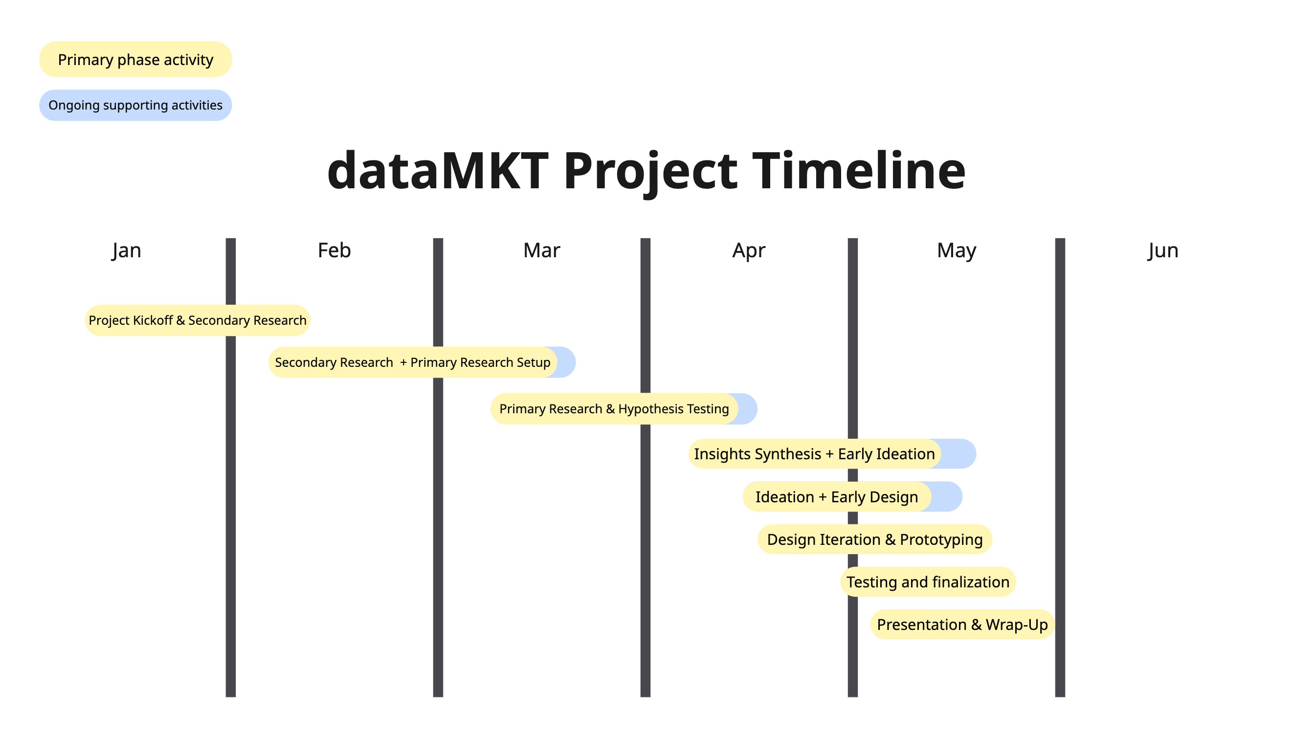
Project Timeline: Visualizing the phases of research and development.
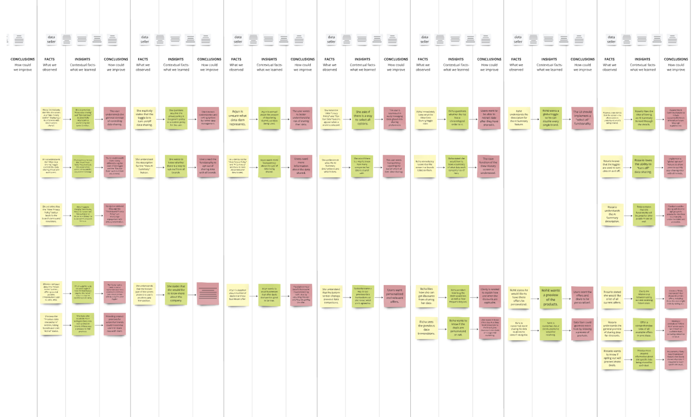
Research Methodology
Secondary Research
Comprehensive market analysis to understand the data economy landscape and validate problem space.
- 30 news articles reviewed
- 10 peer-reviewed journals analyzed
- 2 historical books on data markets studied
- Market context and problem validation generated
Primary Research
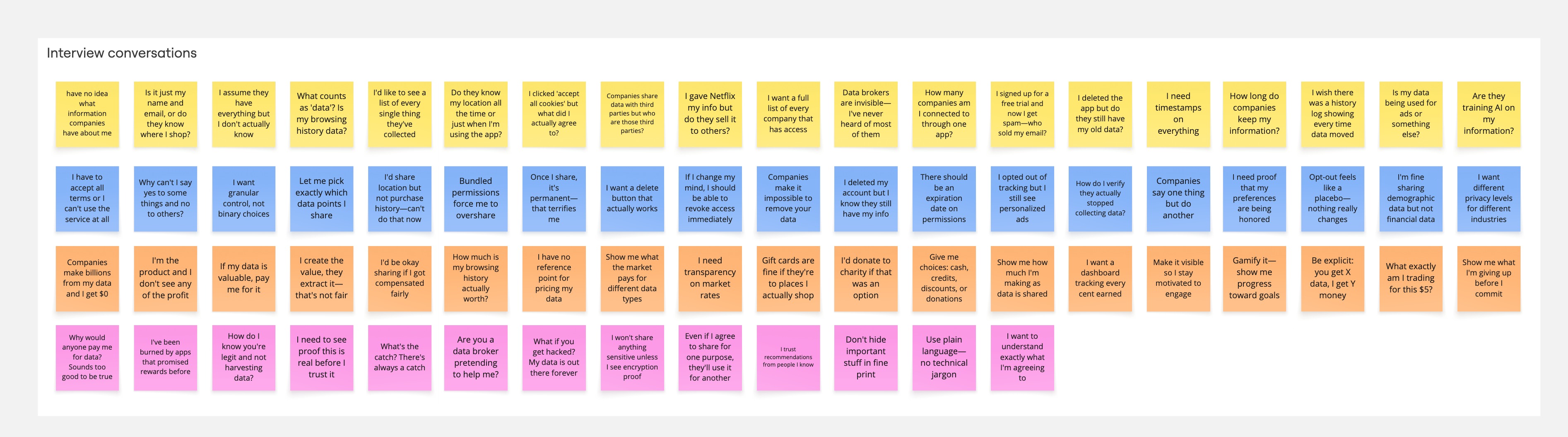
Qualitative interviews to test hypotheses and understand user perspectives on data marketplace concepts.
To arrive at these results, I interviewed:
- 4 industry experts
- 20 consumers
- Age range 20-65
- Industry experience of 20+ years
Usability Testing
Prototype validation to evaluate navigation, workflows, and trust signals in the designed interface.
- 8 participants for prototype testing
- 3 core workflows tested
- Navigation and task completion evaluated
- Trust signals and visual design validated
Research Insights by the Numbers
The devised problem statement led us to our ‘How might we’ questions, which would serve as guiding pointers to build dataMKT, the consumer data exchange platform.
How might we help consumers understand and block invasive data collection before it happens?
How might we enable consumers to see, control, and capture value from their personal data?
How might we create collective bargaining power for consumers in the data marketplace?
To test the ‘How might we’s, I conducted user research interviews, testing all three hypotheses to understand the most viable concept to build on. The results were as follows:
Hypothesis Testing Framework
Three competing concepts were evaluated through user interviews to determine the optimal approach for building trust and engagement.
Privacy-First Model
❌ RejectedRationale: Insufficient retention driver. Users valued privacy but it wasn't enough to sustain long-term engagement.
Key Finding: Users questioned platform sustainability without immediate value proposition. Privacy alone didn't drive daily engagement.
Visibility-Control-Value
✓ SelectedRationale: Balanced trust-building approach. Natural progression that resonated with all user archetypes.
Impact: Estimated 40% increase in user retention through marketplace-economy positioning versus privacy-utility positioning.
Key Finding: Sequential trust-building through transparency, followed by control, and culminating in tangible value created sustainable engagement.
Transaction-First Model
❌ RejectedRationale: Created distrust and anxiety. Users felt uncomfortable with immediate monetization without understanding the platform.
Key Finding: Perceived as manipulative. Users needed trust foundation before engaging in transactions.
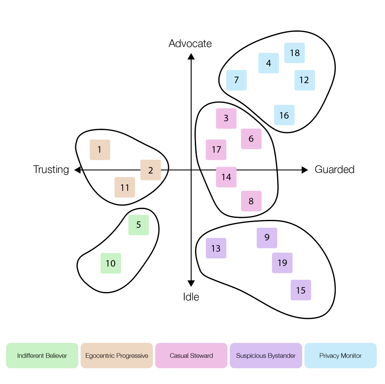
User Personas
Five distinct archetypes emerged from our research, each with unique motivations, behaviors, and concerns about data sharing.
Egocentric Progressive
Indifferent Believer
Casual Steward
Suspicious Bystander
Privacy Monitor
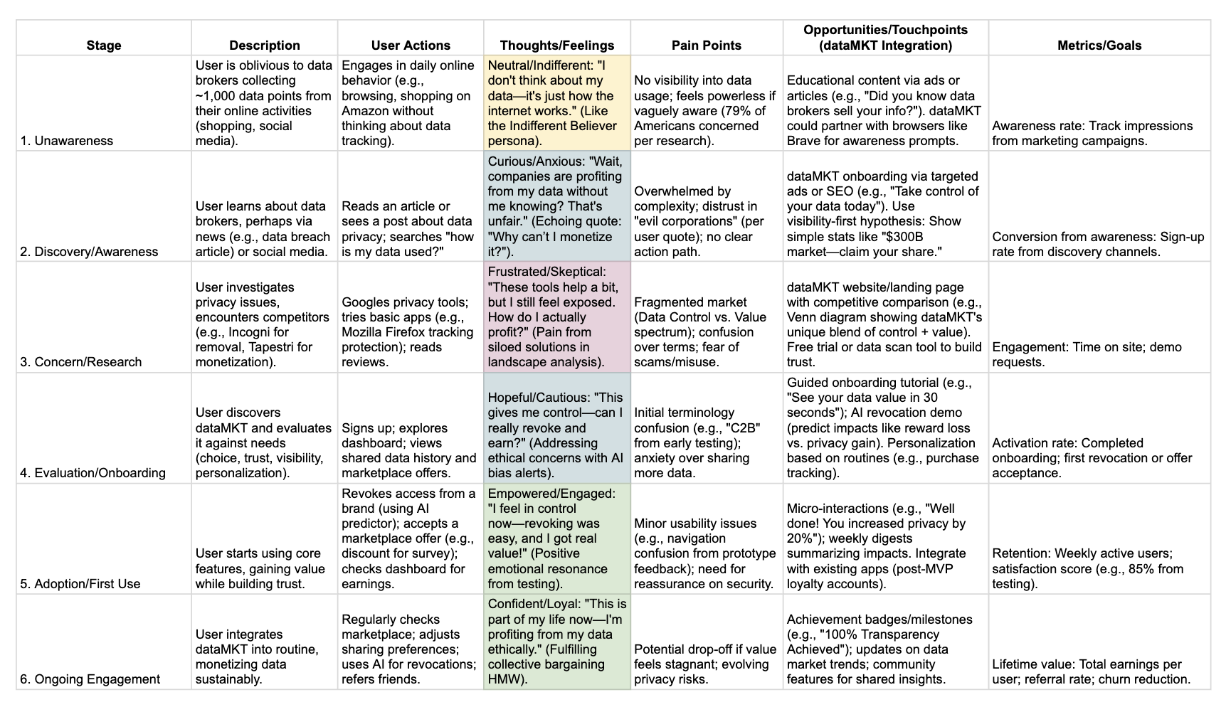
User Journey Map
Strategic Pivot
User research revealed that privacy alone was insufficient to drive engagement. We pivoted from a protection tool to an economic marketplace.
Focus on protection and control without clear value proposition
Transparent value exchange with privacy as foundation
Estimated increase in user retention
Based on 24-participant interview cohort testing three hypothesis models
Pivot Rationale
Users demonstrated unwillingness to engage without immediate value. The Privacy-First Model testing showed engagement drop after initial curiosity, with users questioning platform sustainability.
Key Finding: The Visibility-Control-Value sequence tested successfully with users reporting a natural progression from awareness to trust to engagement.
Impact: The pivot transformed the product from a "protection tool" to an "economy," aligning consumer incentives with platform sustainability and creating a compelling daily engagement loop.
Based on the user journey map and sketches, we brainstormed clusters of ideas and created affinity maps that would become the core features of dataMKT.
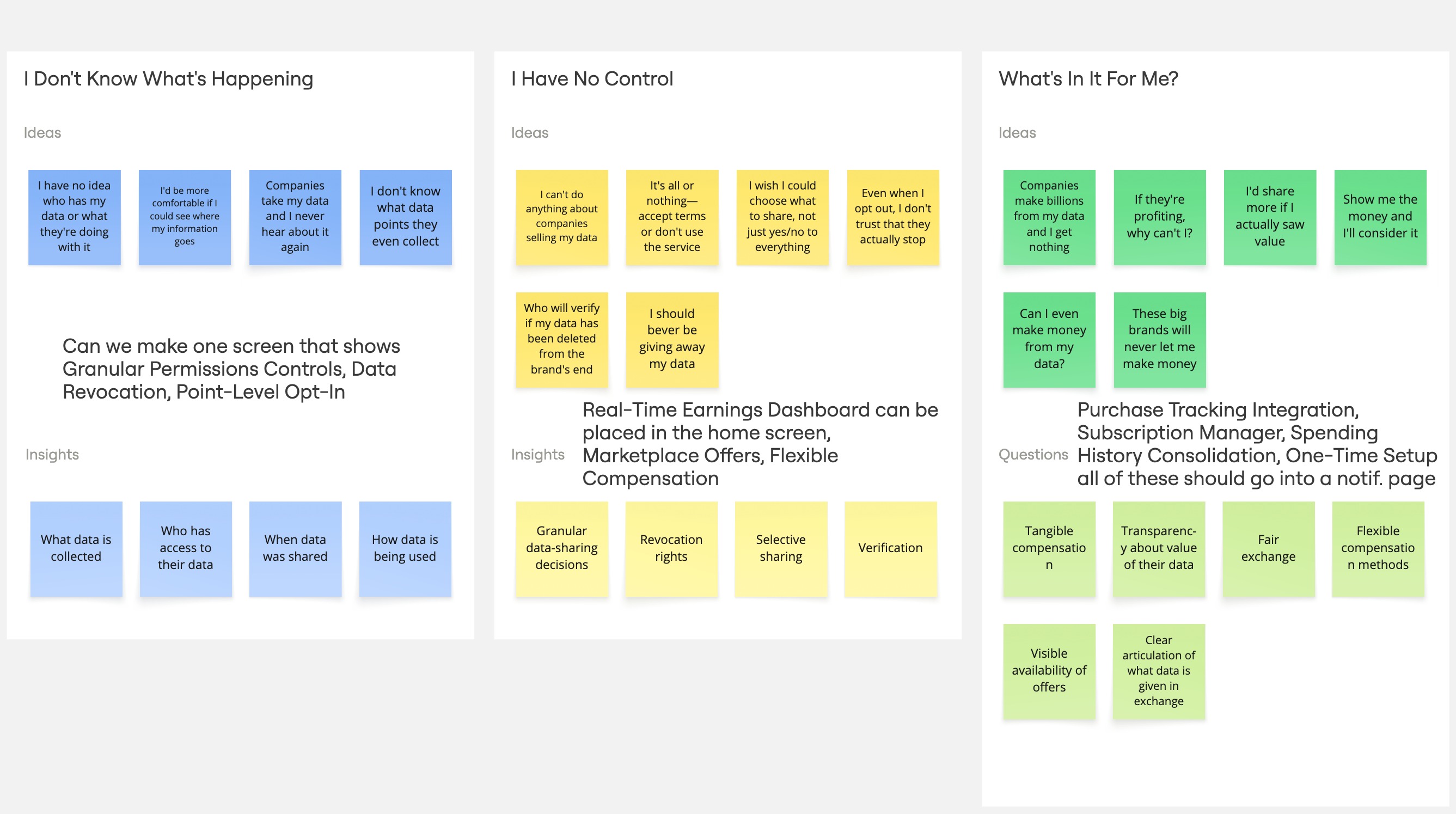
Design Foundation: Four Pillars
Choice
User agency in data-sharing decisions. Every interaction is an opt-in, giving users complete control over what they share, with whom, and for how long. Data point-level granularity with flexible compensation methods.
Trust
Platform credibility regarding monetization. Clear communication about how data is used and who pays for it. Addressing fears about scams, misuse, and ethical implications through transparency infrastructure.
Visibility
Transparent data usage tracking. Users can see exactly what data has been shared, when, with whom, and for what purpose. Action history tracking with data recency awareness and clear term definitions.
Personalization
Integration with daily routines. The platform fits seamlessly into users' lives through purchase tracking, subscription management, and spending history consolidation without adding friction.
Design Solution
All synthesized data were used to develop the design for dataMKT. We created low-fidelity to high-fidelity mockups to prototype test with our users and experts.
Design Development Process
Iterative Design Phases
Low-fidelity exploration → Information architecture → High-fidelity prototyping → Usability testing
Phase 1
Low-Fidelity ExplorationEarly sketches and rudimentary mockups for conceptual validation
Phase 2
Information ArchitectureCore features mapping and navigation hierarchy establishment
Phase 3
High-Fidelity PrototypingDetailed mockups with visual design system applied
Phase 4
Usability Testing8 participants testing three core workflows
Strategic Design Decision
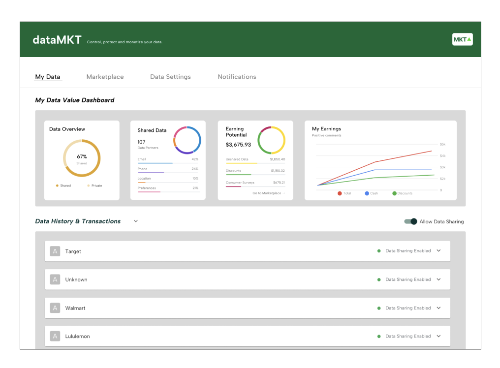
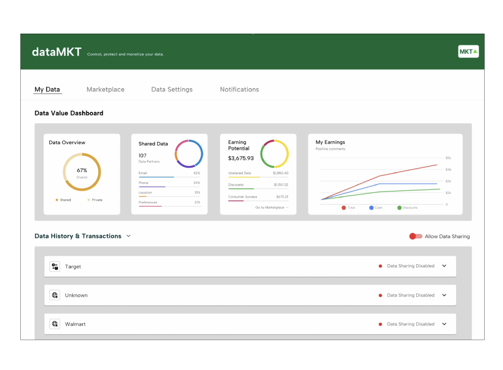
Homepage prioritized "Wallet" feature over "Settings" to drive daily monetization loop engagement rather than burying value visibility. This decision emerged from testing the Visibility-Control-Value sequence.
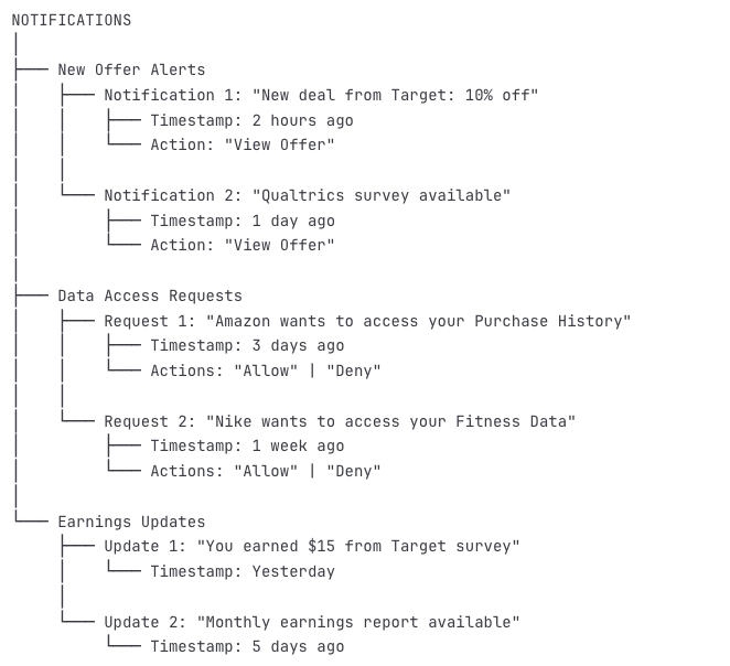
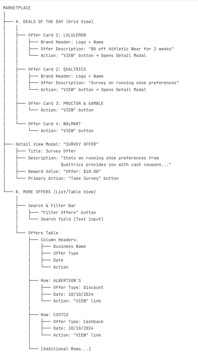
Three Core Workflows Tested
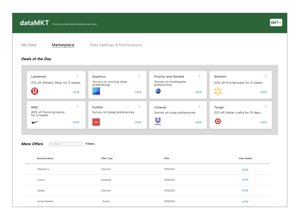
- 1. Data Sharing Management: Navigate to settings, review active data-sharing companies, revoke permissions, adjust data type preferences
- 2. Marketplace Exploration: Explore available offers, evaluate earning potential, complete value-boosting surveys, adjust offer preferences
- 3. Transaction History: Access data receipt archive, request copy of shared data, revoke/delete data from companies
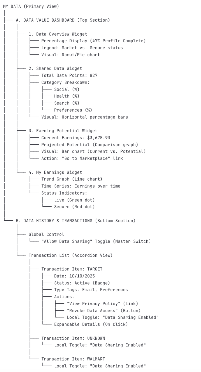
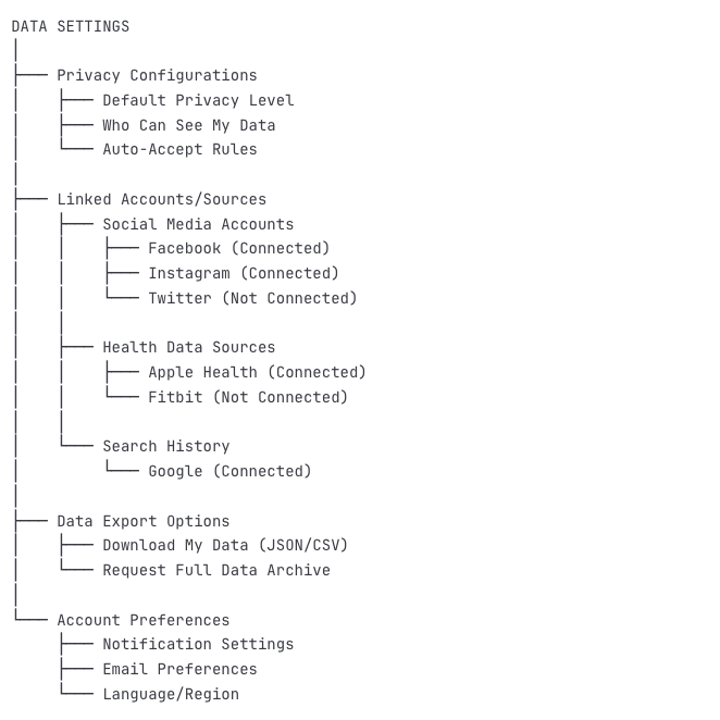
Information Architecture: Structuring the app for intuitive navigation.
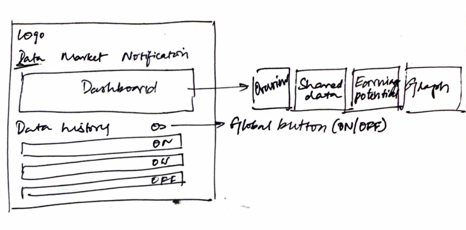
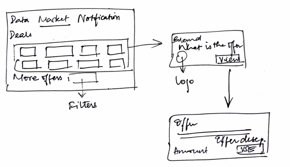
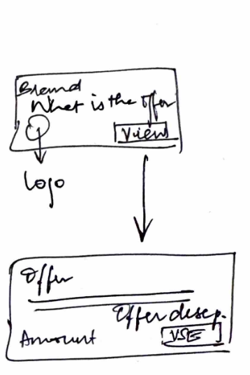
Early Sketches & Ideas
Hand-drawn explorations and initial conceptual frameworks that shaped our design approach. These low-fidelity sketches helped us test ideas quickly and understand user feedback before investing in high-fidelity designs.
Sketching Phase Overview
Using our early low-fi sketches, a rudimentary interface was developed to understand user feedback based on our testing. These sketches captured initial thinking about information hierarchy, user flows, and key interaction patterns.
Goal: Rapidly explore multiple concepts without commitment to visual polish, focusing on core functionality and user mental models.
Key Insights from Hand Sketching Phase
Visibility Before Control
Early sketches tested control-first interfaces, but user feedback revealed people needed to see what data exists before they cared about controlling it. This insight reshaped our information architecture.
Value Must Be Visible
Sketches that buried value displays in secondary screens failed user testing. The breakthrough came when we sketched the "Wallet" as a primary homepage feature—making monetization the engagement hook rather than an afterthought.
Simplification Through Sketching
Hand sketches forced us to simplify complex data relationships into understandable visual patterns. What couldn't be drawn simply couldn't be understood easily—this became our design litmus test.
Mobile Constraints Drove Focus
Sketching mobile-first layouts revealed we couldn't fit everything on one screen. This constraint forced ruthless feature prioritization that ultimately improved the desktop experience too.
From Sketch to Reality: Evolution of Key Features
How hand-drawn concepts transformed into the final interface design.
Initial Sketch Concept
Dashboard Layout: Three-column layout with data inventory, active permissions, and recent transactions
User Feedback: "Too much information at once—overwhelming"
Final Implementation
Dashboard Layout: Single-focus wallet feature with progressive disclosure for detailed views
Result: 85% task completion rate in usability testing
High Fidelity Prototypes
Interactive Prototype
Interact with the high-fidelity prototype above.
Key Learnings & Insights
What Worked
- Language Design Matters: Simplified terminology without condescension increased accessibility and perceived user agency across all personas
- Visualize Value: Abstract data concepts require tangible dashboard representation to generate protective behavior and sustained engagement
- Transparency Scales: Control elevation from secondary settings to primary interface signaled user prioritization and built immediate trust
- Action Pathways Critical: Agency requires both awareness and actionable mechanisms; visibility alone is insufficient for engagement
Missed Opportunities
- Earlier Brand Stakeholder Validation: Would have accelerated monetization model development and ensured business viability earlier in process
- Larger Sample Sizes: 8 usability participants insufficient for statistical significance; A/B testing on core hypotheses would strengthen confidence
- Long-term Engagement Mechanisms: Retention drivers beyond initial onboarding remain untested; need extended engagement modeling
Strategic Implications
The project demonstrates that consumer empowerment within data markets represents both an ethical imperative and a business opportunity—particularly as third-party cookies deprecate and regulations tighten globally.
Balancing Act: Success requires sophisticated incentive alignment between three stakeholders:
- ▸ Consumers: Maximum value capture and granular control
- ▸ Brands: Affordable access to quality first-party data
- ▸ Platform: Sustainable business model and trust maintenance
Key Takeaway: Consumer data markets require business model design alongside interface design. The pivot from privacy-first to marketplace-economy positioning was critical to achieving this balance.